MUSIC ARTIST BRANDING PROJECT
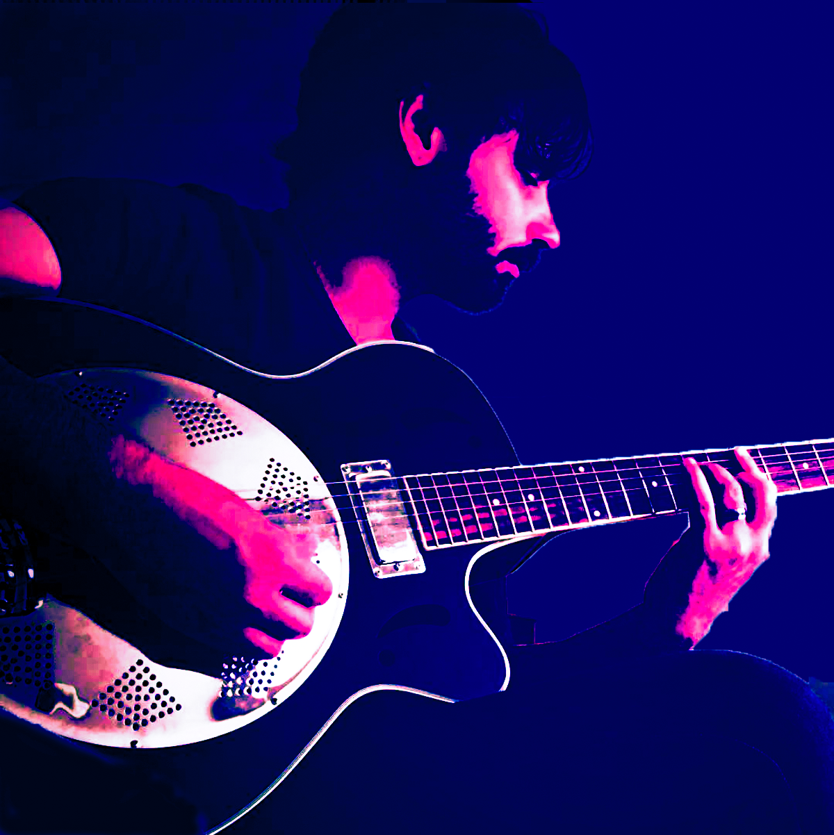
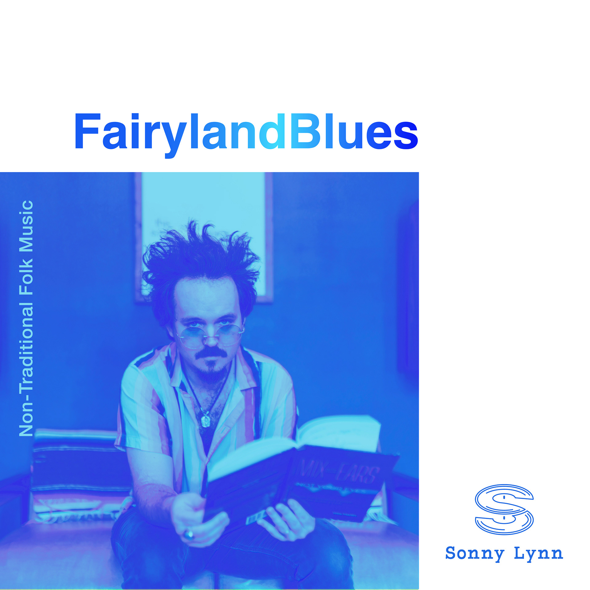
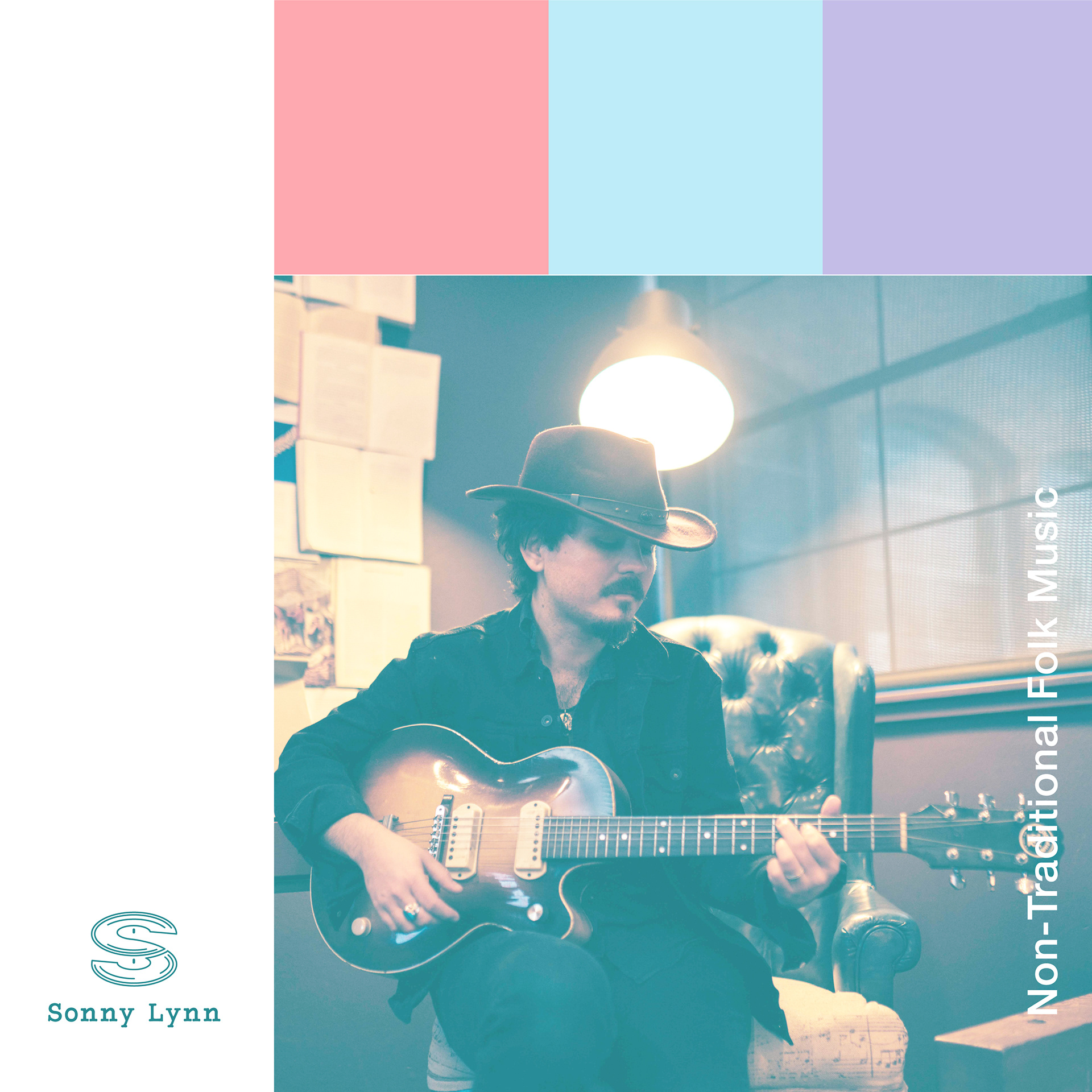
The artist parameters for a series of 3 singles covers culminating into an EP to conclude the series were something simple yet impactful. By using color blocks and the 4 corners of the cover area the design allowed the liberty to really give this project some life while maintaining those parameters. While working close with Sonny Lynn Adobe Photoshop was used to manipulate and color the photo giving it the nostalgic yet current feel he wanted expressed. The project was finalized using Adobe Illustrator to formatting and font placement
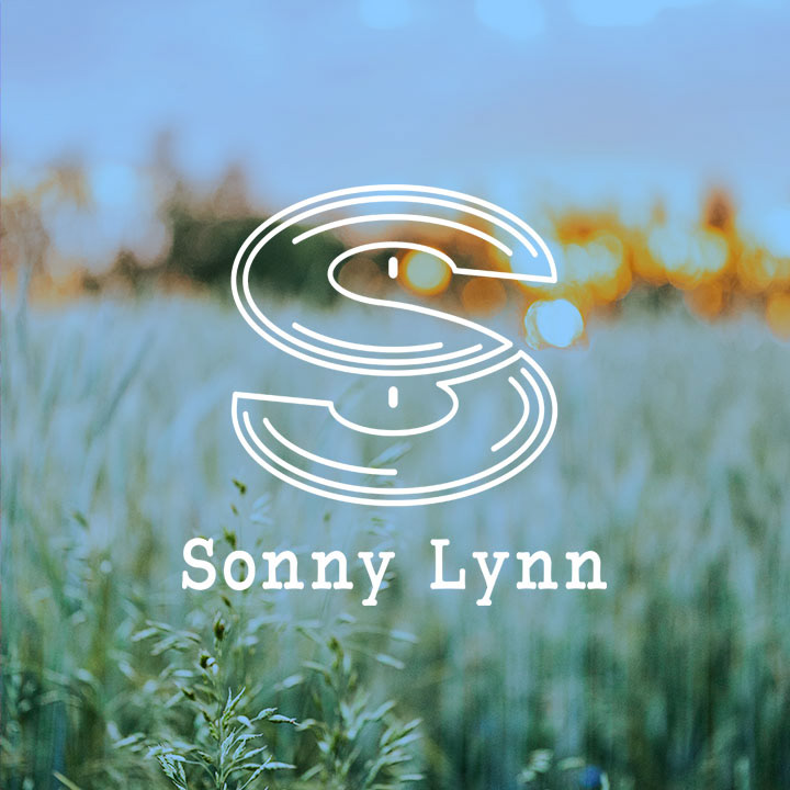
LOGO
The artist requested a logo that harkened back to the older vintage logos of older record labels. After creating a few options, and a few tweaks he set his mind on this. The initial thought was as the record goes around if seen from an angle the light would wash out that particular part of the record. So after analyzing how that presented the notion came to me that if I stacked and flipped one we could get the "S" that is seen here.
SINGLE COVER SERIES
The artist parameters for a series of 3 singles covers culminating into an EP to conclude the series were something simple yet impactful. By using color blocks and the 4 corners of the cover area the design allowed the liberty to really give this project some life while maintaining those parameters. While working close with Sonny Lynn Adobe Photoshop was used to manipulate and color the photo giving it the nostalgic yet current feel he wanted expressed. The project was finalized using Adobe Illustrator to formatting and font placement
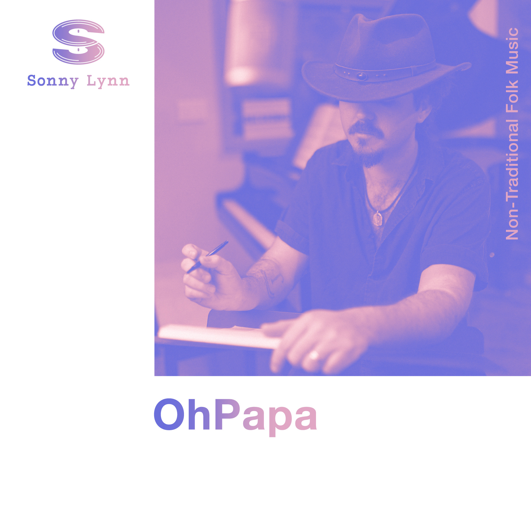
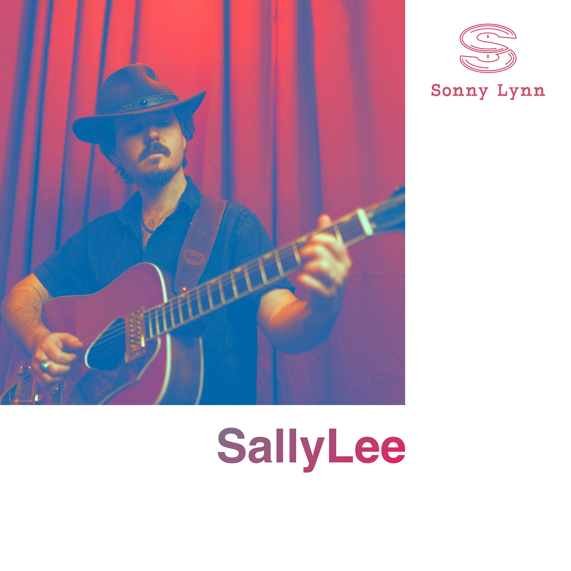
SINGLE COVER
The artist wanted something that would pop off the cover while expressing the tracks overall message of "forbidden fruit".

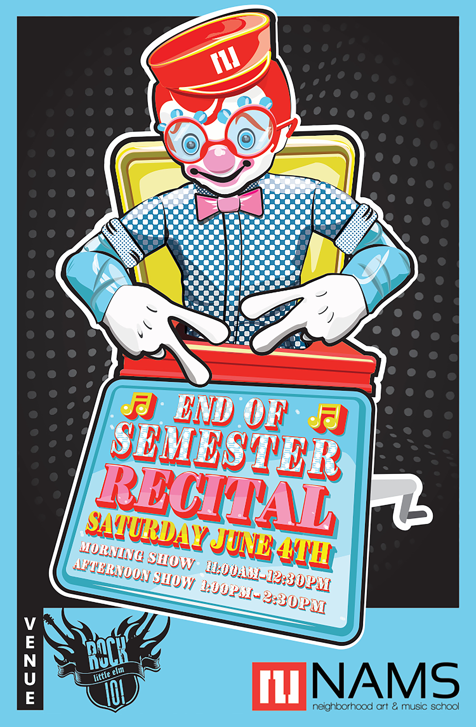
RECITAL POSTERS
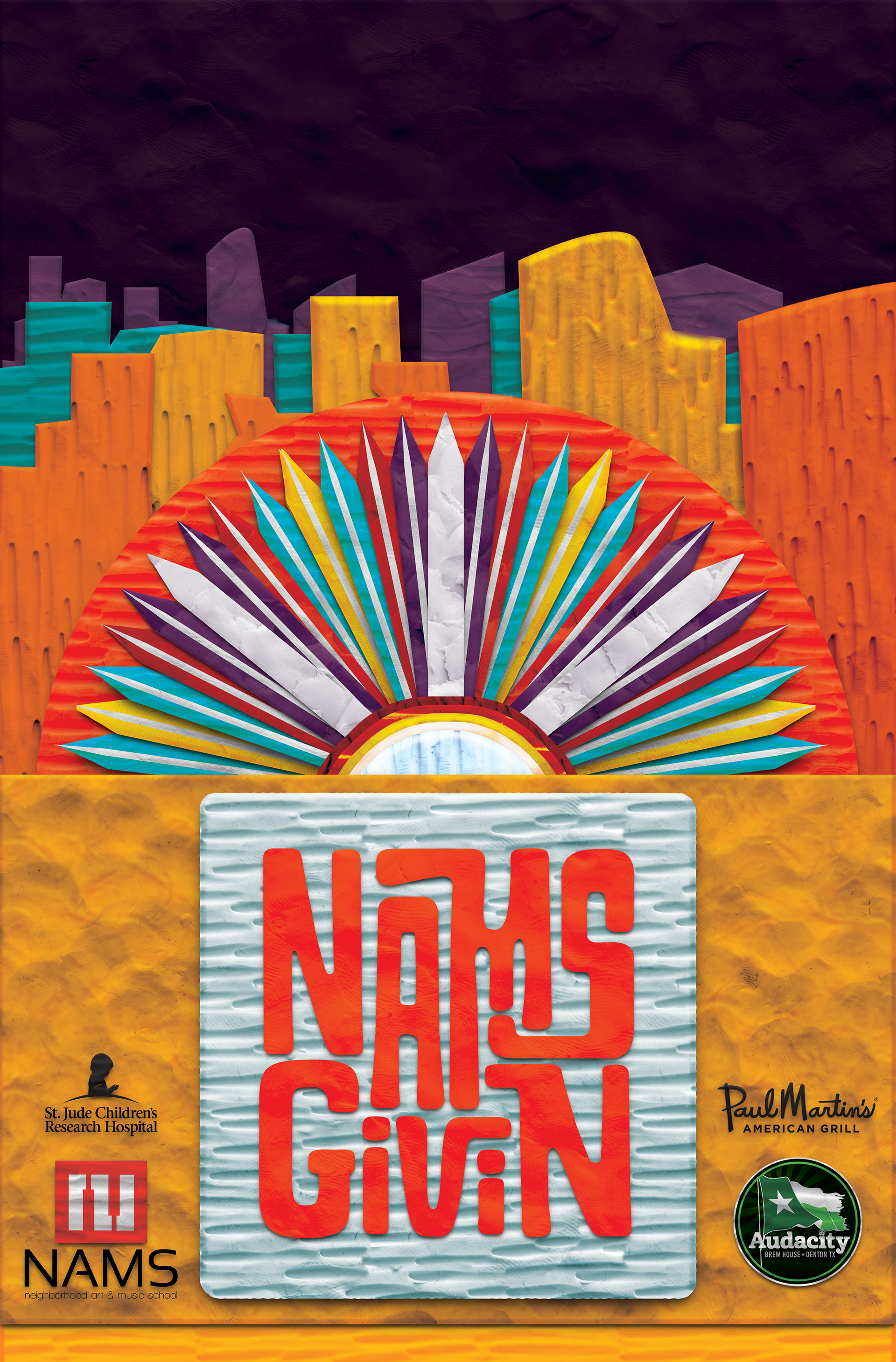
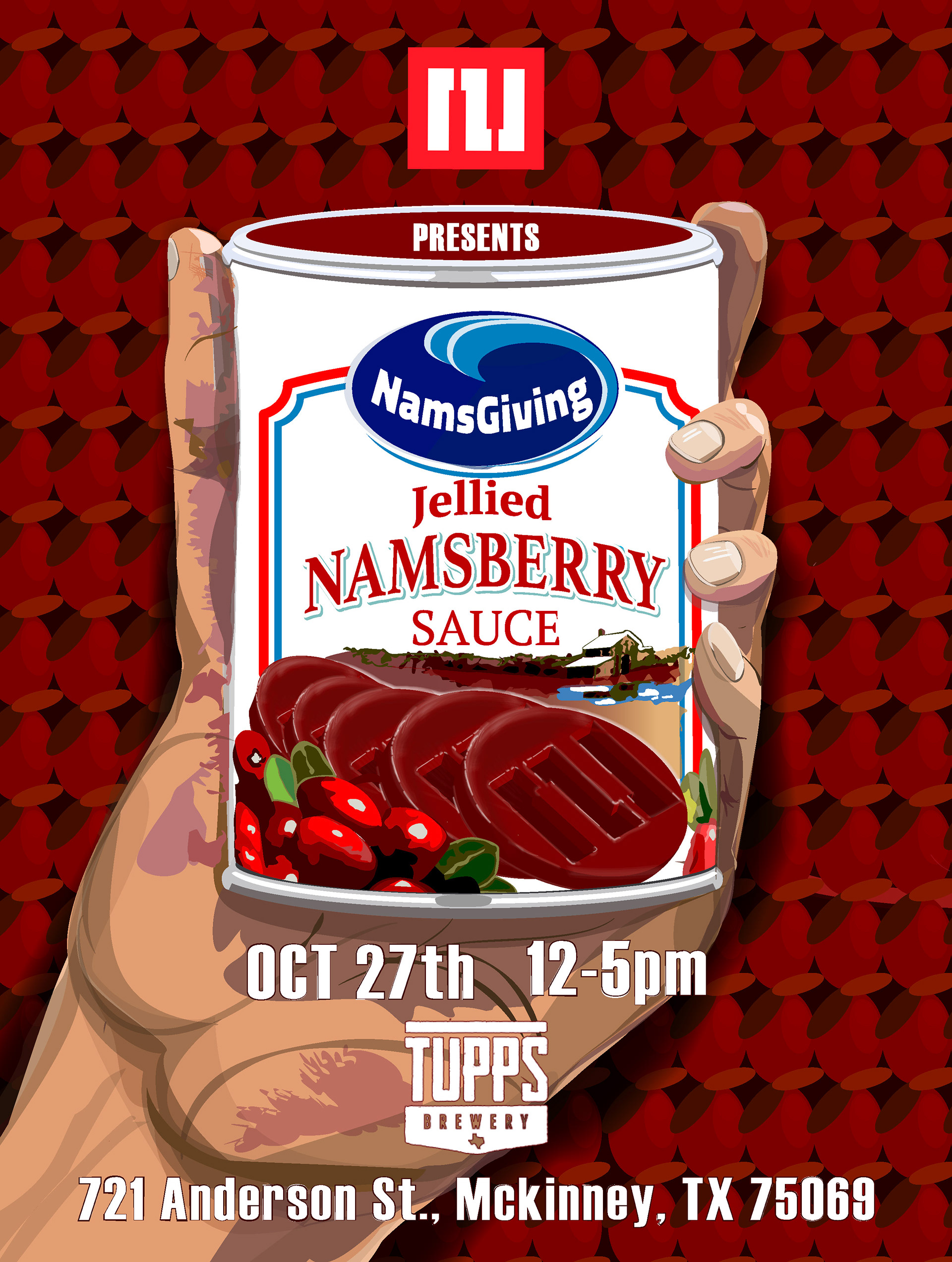
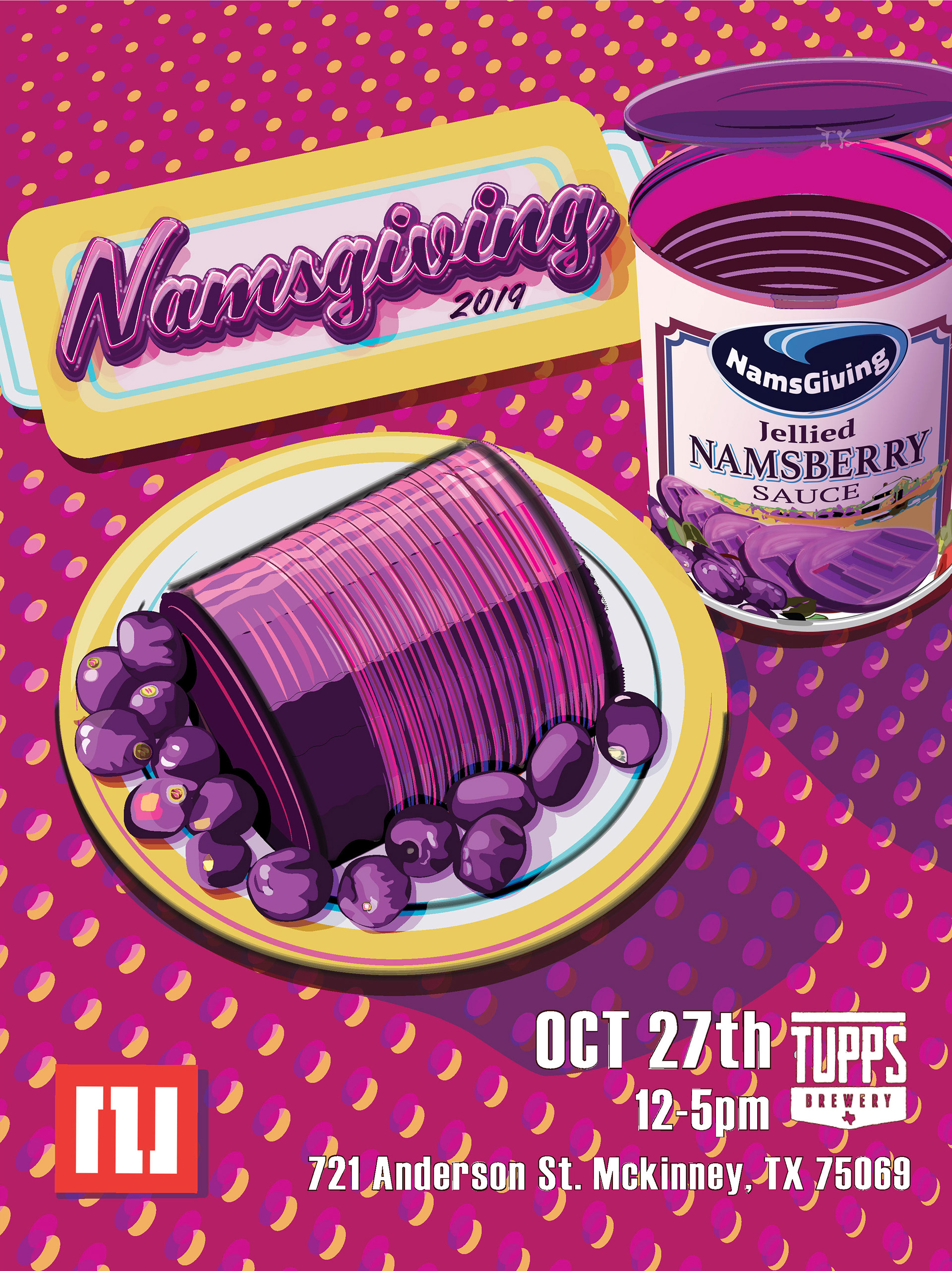
NAMS (Neighborhood Arts and Music School) recital posters and art work.